
The Principles Of Modern Design - In today's world, design surrounds us. From our clothing to our homes, we are constantly engaging with designs. It's no surprise that we all appreciate a well-designed product, whether it's the latest smartphone or a beautiful piece of furniture. However, what is it that makes a design "good"? The answer is rooted in modern design principles that have guided designers for decades.
The Basics of Design Principles
What are Design Principles?
Design principles are the guidelines that designers follow when creating anything visual, whether it's a website, a poster or a piece of furniture. These principles are applied to each design to ensure that it meets its purpose, communicates its message clearly and is visually attractive.
There are many different design principles out there, each with its focus, but the most commonly used ones include:
- Balance
- Emphasis
- Contrast
- Repetition
- Proportion
- Alignment
Why are Design Principles Important?
Design principles are essential because they're the foundation on which all great designs are built. They give designers a framework to work within, ensuring that the end product is a cohesive and well-designed piece. By following these principles, designers can create designs that are visually pleasing, communicate their message effectively and are easy to navigate.
Applying Design Principles to Modern Design
Balance
Balance is a fundamental principle that governs modern design. It refers to the visual weight of elements in a design and how they're distributed across the space. When designing, it's important to ensure that the elements are balanced to create a harmonious and attractive design.
When implementing balance, it's essential to consider both the size and the placement of each element. Elements of different sizes can be balanced by grouping them together, creating a visual hierarchy of size. Similarly, elements can be balanced by being placed in such a way that they complement one another.
Tips for using balance:
- Create a visual hierarchy with size
- Align elements to create harmony
- Use contrasting colors to balance
Emphasis
Emphasis can be described as the focal point of a design, drawing the viewer's attention to a particular element. In modern design, emphasis is crucial for communicating the desired message and creating a strong visual impact. There are many ways to create emphasis, such as contrasting colors or sizes, sharp edges or bold typography.
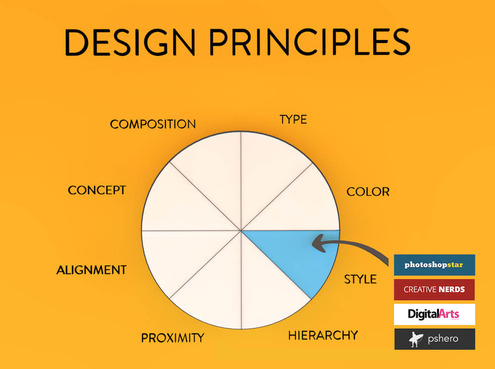
Tips for using emphasis:
- Use contrasting colors to make an element standout
- Use size to create a visual hierarchy, with the most important element being the largest
- Use typography to create emphasis with bold or italicized characters
Contrast
Contrast is the principle of using differences to create visual interest in design. These differences could be anything from color to size, shape or texture, but regardless of the specific differences, the point is that they should create an intentional difference that catches the viewer's eye. Contrast is a great way to create a dynamic visual experience and draw the viewer's attention.
Tips for using contrast:
- Use contrasting colors to make a design stand out
- Use contrast in size to create a hierarchy
- Experiment with texture and shapes to create contrast
Repetition
Repetition is a crucial principle in modern design, referring to the repetition of elements across the design. This could be repeating shapes, patterns or colors, and the point is to create a sense of cohesion within the design. Repetition helps to create a mood or ambiance and can be used to set the tone for a design.

Tips for using repetition:
- Use repetition to create visual interest, without being overwhelming
- Repeating colors can help create a cohesive color palette
- Repeating shapes or patterns can help establish a theme
Proportion
Proportion is the principle that governs the relative size of elements in a design. It's about ensuring that the size of each element is in proportion to the others, creating a harmonious design. When designing, it's important to consider these proportions, so that size doesn't become a distracting factor.

Tips for using proportion:
- Use proportion to create a visual hierarchy
- Use the rule of thirds to create balanced images
- Consider the overall design space when determining proportion
Alignment
Alignment is the principle that ensures that elements in a design are properly spaced and aligned. Alignment creates a sense of order and structure, grounding the design in reality. It can be used to create a grid or a structure for a website or poster, ensuring that each element is placed within the proper framework.
Tips for using alignment:
- Use grids to create a structure for web or print designs
- Align elements to create a balanced and harmonious design
- Consider the overall design space when determining alignment
How to Implement Design Principles into Your Work
Now that you have a basic understanding of modern design principles, it's time to put them into practice. Here are a few tips to help you implement these principles into your designs:
- Start with a clear purpose and objective for your design
- Establish a color palette based on your design's purpose and mood
- Create a hierarchy with your elements, using size and emphasis
- Use contrast, repetition and alignment to create visual interest and balance
- Test your design to ensure that it communicates its intended message
- Get feedback on your design to continually improve and refine
By following these tips and utilizing modern design principles, you'll be able to create visually stunning and effective designs. Whether you're designing a website or a poster, these principles will help you communicate your message, attract attention and create an unforgettable design.
So what are you waiting for? Start implementing modern design principles into your work today!
Find more articles about The Principles Of Modern Design